Thursday, June 30, 2011

Paper Players sketch challenge

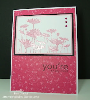
The Paper Players have a sketch challenge this week that I wanted to participate in.  I had a vision in my mind of what I wanted.  I started cutting paper and putting everything together and my end result was not exactly what I thought it would be.  The flowers look a bit weird being cut apart.  Oh well, live and learn on what works and what doesn't.

Stamps:  Build A Blossom
Paper:  white, black
DSP:  paper pack from Hobby Lobby
Ink:  Black, Marina Mist
Accessories:  polka dot embossing folder, brads, dazzling diamonds, ribbon (non-SU)
All products are SU unless otherwise noted.

The picture does not do this card any justice.  The black looks much better in real life.  I think because the photograph was dark and I lightened it up with my photo shop program, that it dimmed the card color. 

Thanks for stopping by and I hope you have a great day!

Pam~

Tuesday, June 28, 2011

Missing You ...

My brother has been on my mind lately so I wanted to send him some love.  Hopefully he doesn't think this is too "girly". I know my sister-in-law will like it.  I got my inspiration for this card from the July issue of Stampin' Success Magazine.  I used similar colors and made a much simpler version. 

     Stamps:  Three Little words, Flight of the Butterfly
Paper:  Vanilla, Island Indigo, Lucky Limeade
Ink:  Soft Suede, Island Indigo, Lucky Limeade
Accessories:  Finial and dots embossing folder, Nestabilities ten label die, vanilla ribbon (non SU), modern label and word window punches, butterfly punch, eyelets (non SU), rhinestones (colored w/sharpie)
All products are SU unless otherwise noted.

The new In-Colors where used on this card, which are available July 1st.

Have a great day,
Pam~

Monday, June 27, 2011

Color challenge...gone wrong

I feel in love with this color combo from seeing Nance's card at Canopy Crafts. Be sure and check her card out here.  It is precious.  Well, I didn't go the website that was hosting the color challenge until a few minutes ago.  You have to use all SU products ... oops!  I can't upload my card there but I can still share it here.   

Stamps:  Happy Healing
Paper:  White, Tempting Turquoise, Old Olive, Tangerine Tango
Ink:  Black, Old Olive
Accessories:  Nestabilities octagon and scallop square die, Prismacolor markers, sponge, glimmer brads, pearls, polka dot embossing folder, dimensionals
All products are SU unless otherwise noted.

I put a lot of bling on this one ... sure to make someone feel better.

Have a great day,
Pam~

Friday, June 24, 2011

Gift Card holder

Happy Friday Friends!  Today I'm posting a gift card holder that I made for Michael to give to a buddy that was having a graduation party.  I got the design from SAZCreations over at Splitcoast.  


Stamps:  Happy Greetings, So Happy For You
Paper:  Night of Navy, Tan (non-SU)
DSP:  Night of Navy, Tangerine Tango
Ink:  Night of Navy
Accessories:  Nestabilities oval dies, twine, brads, label punches
All products are SU unless otherwise noted.

Here is a picture of the inside ...


  • Above the orange panel is where the gift card slides in.  I should have put it in there for the picture.  
  • The measurements are ... 4 x 12 cardstock scored at 4 inches and 8 inches.  The third panel is trimmed before being folded over and attached.
  • Michael's friend is also heading to Auburn this fall.  I used the school colors for the DSP.  
Thanks for stopping by today!  I am heading to Birmingham with Michael for soccer.  He is playing in the Alabama Sports Festival this weekend.  It is like the Olympics for the state.  He has participated in the soccer event for the last two years.  It is always fun and HOT!  I will miss Bethany not going with me ... darn job.

Have a great day,
Pam~

Thursday, June 23, 2011

PPA99 - CAS Element of Style - Stars

Hello Friends!  Today is Thursday which brings another Pals Paper Arts challenge.  This week we are featuring clean and simple with an emphasis on stars and/or military.  Let's see those patriotic cards this week.  Ready for some inspiration ... take it away with Bette Milder!

Ppa99starsmilitary

This was a fun card for me.  I love the happiness that red, white and blue represent ... sure to put a smile on everyone's face.  When I was looking through my "current" stamps, I came to realize that I didn't have any stars.  The only star that I found was in a Christmas set.  The inky fingers went to play and created this ...

Stamps:  Christmas Classics, Itty Bitty Bits
Paper:  White, Real Red, Pacific Point
DSP:  Real Red
Ink:  Real Red, Pacific Point
Accessories:  Itty Bitty punch, pearls, Real Red ribbon, designer button, dimensionals, glue dots
All products are Stampin' Up.

  • I snipped a thin strip of Pacific Point cardstock and used that to tie a knot in my button.
  • I popped up the smaller stars from Itty Bitty Bits on dimensionals to give the larger stars definition.
As always, thanks for stopping by and I always read and appreciate the comments that you leave.

Have a great day,
Pam~


Wednesday, June 22, 2011

Delicate Doilies

Today I'm showing off one of the new stamp sets, Delicate Doilies, that will be available July 1st in the catalog.  I'm not a doilies kind of person, but just had to get my hands on this set.  So glad I did ... it's gorgeous and fun to play with ... so many ideas!


Stamps:  Delicate Doilies
Paper:  Early Expresso, Sahara Sand, Vanilla, Cajun Craze
DSP:  Sahara Sand, Cajun Craze
Ink:  Cajun Craze, Versamark
Accessories:  embossing tool, clear embossing powder, rhinestones, Early Expresso ribbon, stamp-a-ma-jig, ticket punch
All products are Stampin' Up!
  • This is a 4 1/4 x 4 1/4 card base.
  • The doily was stamped in Cajun Craze and then stamped over in Versamark, sprinkled with embossing powder and heated.
  • This is a CASE from Beate at Splitcoast.  I was looking at my cards that I have put in my favorite folder and saw this one from 2007.  To see her card, click here.
  • I used a different stamp, different shades of paper, and a much simpler version. 
Have a great day,
Pam~


Tuesday, June 21, 2011

Clean & Simple challenge

Today I had a great day with Bethany.  We went shopping and then met Michael for lunch.  After lunch we, minus Michael, went to Hobby Lobby to use our 40% off coupon.  Can't let a good coupon go to waste.  We bought some goodies, so we had to come home and go straight to my craft room.  I was making cards and Bethany was scrapbooking.  Think that is her real passion.  Here is Bethany among our mess.  (She is gonna kill me for putting up this picture, but I thought it was funny.)


Hmmm...guess you can tell where I sit by the reading glasses on the table.  Unfortunately, I can't work without them now.  

I wanted to play with gals over at The Paper Players as they had a clean and simple challenge this week.  

The hardest part of this card ... deciding on which stamp to use.  

Stamps:  Upsy Daisy
Paper:  White, Black, Pretty Pink
DSP:  Ice Cream Parlor (sale-a-bration)
Ink:  Pretty in Pink, Black, Versamark
Accessories:  rhinestones, sharpie marker, stamp-a-ma-jig, embossing powder, heat tool
All products are SU unless otherwise noted.
  • For my main image I stamped the daisies in Pretty in Pink, then using my stamp-a-ma-jig, I restamped the daisies in versamark.  Next I added clear embossing powder and my heat gun.  I tried to show off the embossed look in the picture.
  • A new technique that Mary Fish showed on her blog was coloring the clear rhinestones with a sharpie marker.  I just had to try that.  Loved the end result and will definitely be doing this again.
Have a great day,
Pam~

Friday, June 17, 2011

Wild Daffodil Melon ...

... the colors for The Paper Players challenge this week.  They look beautiful together and make for an awesome card.


I thought I would do something different for this card.  I randomly opened up the catalog and picked a stamp set that was on that page and started creating.  I knew I wanted to try a layout that I saw on one Gina K.'s video.  The inky fingers had a great time making this ...

Stamps:  Cottage Garden
Paper:  Daffodil Delight, Melon Mambo, Wild Wasabi, White
DSP:  Melon Mambo
Ink:  Melon Mambo, Daffodil Delight, Wild Wasabi, Black
Accessories:  stamp-a-ma-jig, rhinestone brads, sponge, daffodil delight
All products are Stampin' Up!

Another simple card that is ready to be mailed.  I see so many gorgeous cards out there with wonderful flowers and embellishments and I always wonder how are they mailed?  The majority of my cards that are made, I put in A2 envelopes.  My question to all you great bloggers ... how do you mail your embellished masterpieces?

I hope everyone has a wonderful weekend.  I'm heading out to lunch and shopping with my best friend ... great start to the weekend!

Have a great day,
Pam~


Thursday, June 16, 2011

Let's get sketchy ...

With Thursday brings another Pals Paper Arts challenge.  This week it all starts with a sketch by my Pal Margaret Moody.


Ppa98

I had the best intentions on making a square card.  Unfortunately my mind was not on the same page as my hand and I cut the paper wrong.  Rather than start over, I just went with what I had.  This is what the 'ole inky fingers came up with ...
Stamps:  Artistic Etchings
Paper:  Crumb Cake, Soft Suede, Baja Breeze, Vanilla
DSP:  Elegant Soiree
Ink:  Baja Breeze, Soft Suede, Crumb Cake
Accessories:  antique brad, circle punches, corner rounder, Nestabilities oval and scallop dies, sponge, dimensionals, eyelets (non SU)
All products are Stampin' Up unless otherwise noted.

I left this card pretty simple but liked the end result.  I sponged each piece of paper with soft suede for an aged look.  

Thanks for stopping by and have a great day!
Pam~

Saturday, June 11, 2011

Graduation thanks

I made this card earlier in the week but forgot to post it ... oops.  I made a few of these for Michael to send out as his thank you cards for graduation gifts.  Tried to create something cute, not too kiddish and masculine.  Think I might have succeeded since Michael said he liked it and was willing to sign his name on them.  


Stamps:  Monkey Business
Paper:  Close to Cocoa, Always Artichoke, Cream (not SU)
DSP:  from an old stash that was bought at a craft store years ago
Ink:  Close to Cocoa, Daffodil Delight, Black
Accessories:  polka dot embossing folder, Nestabilities circle and scallop die, twine, dimensionals
All products are SU unless otherwise noted.

I used this week's MOJO sketch as my starting point.  You can always find a good sketch over there.  I rock n' rolled the banana's to add a little definition to them.

Thanks for stopping by and remember the door is always open, so please stop by often.

Have a great day,
Pam~

Thursday, June 9, 2011

Your Signature Style

Hi friends!  This week at Pals Paper Arts we are hosting another great challenge ... your signature style.  Show us what your go to layout, ink color, and/or embellishment is.  Maybe it is a certain card stock or stamp.  Have fun with this challenge and be sure to post it for all to see!  

Below is a little inspiration ...

PPA97

My go to is usually a fun or animal themed card.  My style is usually not very formal and fancy.  Every once in a while I might pull one out of my sleeve though.  For today's challenge, I went with a cute card for my sister-in-laws birthday.

Stamps:   Happy Together, Birthday Bliss
Paper:  Pacific Point, Bashful Blue, Pear Pizzazz, Real Red, White
Ink:  Pacific Point, Bashful Blue, Pear Pizzazz, Garden Green
Accessories:  circle punches, scallop punch, sponge daubers, dimensionals
All products are Stampin' Up unless otherwise noted.
  • I punched out a bunch of different sized circles and glued them randomly. After my paper was covered and the glue dried, I trimmed all the edges.
  • My idea for creating this circle background came from the Designer Series Paper Celebrations in the 2010-11 Idea Book & Catalog.  I really liked the the paper so decided to create my own since I didn't own it.
  • I sponged Bashful Blue to make a sky and Pear Pizzazz and Garden Green for the grass.
This is one of those cards that just made me feel good when I was done.  My sister-in-law almost didn't get it but I forced myself to put it in the mail today.  Do you ever hoard your favorite cards that you make?

I hope everyone has a "cool" day.  We have been scorching here in Alabama for the last couple of weeks.   I'm looking forward to checking out your great creations!

Pam~


Thursday, June 2, 2011

Think about the men in your life ...

The challenge this week at Pals Paper Arts is all about color and making a masculine card.  Here is the starting point ...
Ppa colors
Below is the ending point for me ...

Stamps:  On The Fly, So Happy For You
Paper:  Cherry Cobbler, More Mustard, Night Of Navy, Confetti Vanilla, 
Ink:  Night Of Navy, More Mustard, Early Expresso
Accessories:  CB embossing folder, eyelet, itty bitty circle punch, word window punch, dimensionals
All products are SU unless otherwise noted.

I'm keeping this post short and sweet tonight.  The eyelids are heavy and I can't stop yawning.  

Until next time ...
Pam~